Different label and hint for TextInputLayout
You can use these attribute:
android:hint: for the labelplaceholderText: for the placeholder text inside theEditText<com.google.android.material.textfield.TextInputLayout android:id="@+id/phone_layout" android:layout_width="match_parent" android:hint="Phone Number" app:placeholderText="+6281342134" android:layout_height="wrap_content"> <com.google.android.material.textfield.TextInputEditText android:id="@+id/phone" android:layout_width="match_parent" android:layout_height="match_parent" android:hint="+6281342134" android:inputType="phone" /> </com.google.android.material.textfield.TextInputLayout>

If the placeholder should be displayed also when the text field is empty just add the expandedHintEnabled="false":
        <com.google.android.material.textfield.TextInputLayout
            app:expandedHintEnabled="false"

Note: the expandedHintEnabled requires at least the version 1.3.0-alpha03.
Here's how I'm doing it without code (just XML), while allowing both a label and a placeholder at the same time, as in the Material Design guidelines.
Layout XML:
<android.support.design.widget.TextInputLayout
  android:layout_width="match_parent"
  android:layout_height="wrap_content"
  android:hint="My Label Text">
  <android.support.design.widget.TextInputEditText
    android:id="@android:id/input"
    android:layout_width="match_parent"
    android:layout_height="wrap_content"
    android:textColorHint="@drawable/hint_selector"
    android:hint="Placeholder Text"/>
</android.support.design.widget.TextInputLayout>
Color Selector XML:
<?xml version="1.0" encoding="utf-8"?>
<selector xmlns:android="http://schemas.android.com/apk/res/android">
  <item android:state_focused="true" android:color="?android:textColorHint" />
  <item android:color="@android:color/transparent" />
</selector>
The key here is to just make it transparent by default, and only show the placeholder text when it has focus. No need to change color either, since this will respect any custom theme in place, as well as light and dark themes.
I took a similar approach to Rehan
<android.support.design.widget.TextInputEditText
    android:id="@+id/edit_text"
    android:layout_width="match_parent"
    android:layout_height="wrap_content"/>
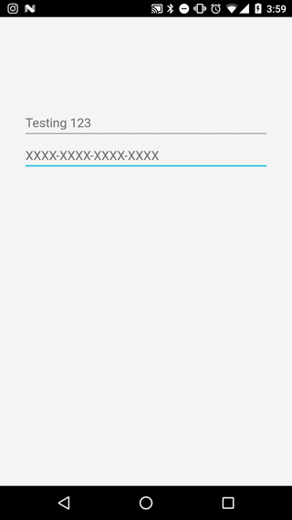
editText.setOnFocusChangeListener(new View.OnFocusChangeListener() {
    @Override
    public void onFocusChange(View v, boolean hasFocus) {
        if (hasFocus) {
            inputLayout.setHint("We did it!");
        } else {
            inputLayout.setHint("Testing 123");
        }
    }
});
The animation was good enough for me without disabling the animation: